
The 2025 color trends are all about creating spaces that are vibrant, welcoming, and timeless. From a lush green that connects us to nature and wellness, to cozy warm neutrals and dramatic jewel tones, this year’s palette defines senior living design with bold yet balanced choices.
Direct Supply® Aptura® Color of the Year: Pesto
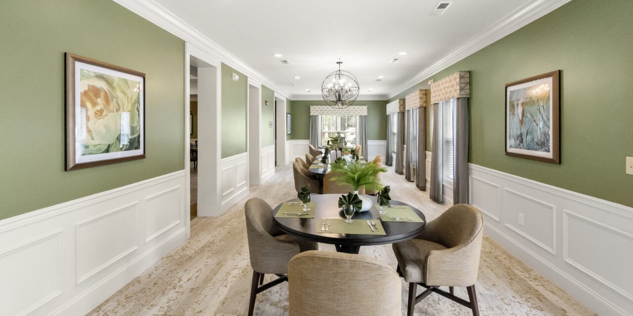
At the heart of 2025’s color trends is Pesto, a rich green that embodies vitality, nature, and the essence of wellness. Imagine the fresh leaves of a thriving herb garden or the lush canopies of a woodland escape — Pesto is as nourishing for the spirit as it is vibrant and bold.
This verdant hue is more than just a nod to greenery; it is a celebration of balance. Pesto’s saturated yet fresh tone breathes life into interiors, making it a versatile choice for designers seeking to connect spaces with nature. In senior living, Pesto shines as an accent wall in dining rooms or lounges, effortlessly pairing with lighter woods or creamy neutrals to create an uplifting and inviting atmosphere. It also brings the outdoors in beautifully through accents like textiles, tiles, artwork, and accessories that evoke the serene charm of a garden retreat.
For a polished look, layer Pesto with soft beiges, terracotta or muted blues. This combination keeps the drama grounded while embracing a harmonious, nutrient-rich palette that feels as good as it looks.


The Magic of Chameleon Colors
In 2025, versatility reigns supreme with chameleon colors that adapt to their surroundings. These hues shift subtly depending on the light, reflecting the tones of their environment and accessories. Think of smoky lilac that appears gray in the morning and lavender at dusk, or a taupe-green that dances between earthy and neutral.
Chameleon colors are the perfect answer for multi-functional spaces, such as activity rooms or dining areas in senior living communities. They respond beautifully to varying lighting conditions, ensuring a space feels dynamic and fresh throughout the day.
To make the most of these tones, layer them with complementary colors in furnishings or artwork to pull out their different personalities. For example, a soft gray-green chameleon wall could be paired with dark wood furniture and brass accents in one setting or with airy whites and glass decor for a lighter effect.

Design Tip
Mix these hues with natural materials like wood, rattan or brushed brass to bring dimension. Accessories like oversized pottery or woven throws amplify the “Potter’s Palette” aesthetic, ensuring the space feels as welcoming as it is stylish.
Muted Earth Tones: Bohemian Dreaming
Earthy tones have long been a staple of grounded, cozy interiors, but 2025 is taking them one step further. Muted versions of these hues — soft terracotta, olive and dusky sienna — bring a relaxed bohemian spirit to interiors. They feel organic and authentic, striking the perfect balance between drama and approachability.
In senior living spaces, these tones can be incorporated in ways that feel both modern and timeless. A terracotta accent chair paired with natural jute and olive-toned cushions creates an environment that feels curated yet effortless. Muted earth tones are also ideal for creating layered palettes: use them as the foundation for walls and larger furnishings, then layer in patterns or textures that nod to global or vintage influences.
This palette shines in smaller details, too. Handcrafted pottery, linen throws or earthenware accessories can echo these hues, adding depth without overwhelming the space.

Saturated Colors Beyond Trends: Jewel Tones
For those who believe in bold design statements, 2025 brings a renewed appreciation for saturated jewel tones like emerald green, sapphire blue and ruby red. These colors transcend fleeting trends, offering a richness and drama that feels luxurious and timeless.
Jewel tones may seem like a bold choice for senior living spaces, but when applied thoughtfully, they can create a striking and transformative atmosphere. Imagine a cozy ‘scholar’s lounge,’ where rich sapphire blue walls are paired with gleaming gold accents and the warm texture of deep leather furniture. In a dining room, emerald-green upholstery adds a regal elegance that elevates the dining experience into something truly memorable.
To keep jewel tones from feeling heavy, balance them with lighter or mid-tone neutrals. For instance, a ruby-red velvet chair can anchor a space when surrounded by soft beige walls and pale wood flooring. Jewel tones also shine in fabric or ceiling details — a painted coffered ceiling in a deep blue can create a dramatic focal point while maintaining overall harmony.
Designers can draw inspiration from fashion by incorporating jewel tones in bold color-blocking combinations. Try mixing emerald green with muted mustard or pairing sapphire with terracotta for a modern twist.

")
How to Integrate Trends in Senior Living Spaces
- Balancing Drama and Comfort- In Senior Living design, creating an inviting and functional environment requires striking a balance. Pair dramatic hues like Pesto or jewel tones with warmer neutrals to ensure spaces feel cozy rather than overwhelming. Mid-tones like muted earth tones act as the perfect bridge, grounding bold colors while adding depth.
- Layering Colors and Textures- Layering is essential to making these trends work in Senior Living. Combine matte finishes with glossy textures, and mix natural materials like stone, wool-looks and wood to create a tactile, multi-dimensional look.
- Enhancing Resident Experience- Color psychology plays a pivotal role in Senior Living. Green tones like Pesto promote relaxation and wellness, while warm neutrals provide comfort. Jewel tones, used sparingly, can add moments of elegance and energy to specific spaces, encouraging engagement and activity.
- Customization for Regional and Cultural Influences- Adapting these palettes to regional or cultural preferences can make spaces feel authentic. For instance, desert communities might lean into terracotta and warm neutrals, while coastal regions could emphasize greens and muted blues.


Conclusion
The 2025 color trends invite us to enhance Senior Living spaces with colors that are as dynamic as they are enduring. From the natural vibrancy of Pesto to the coziness of warmer neutrals and the drama of jewel tones, these palettes offer something for every design aesthetic. In Senior Living, these trends go beyond aesthetics to enhance the resident experience, blending style with purpose.
Embrace these colors thoughtfully, layering them to create interiors that feel fresh, balanced and timeless. Whether you’re designing a modern “scholar’s lounge” or a bohemian-inspired community room, these hues promise to transform spaces into vibrant, welcoming retreats.
Feeling inspired? Download the 2025 Design Trends E-book, or contact us today to get started on your next project.
Written by Rebecca Jourdan, IIDA, LEED AP,
NCIDQ Certified Senior Lead Interior Designer
2025 Senior Housing Design & Construction Trends
Learn what’s trending in the industry and how you can use these trends in your buildings.


